
Let's Dish
Let’s Dish is a cooking-themed mobile video game with a match-3 game mechanic. Think Candy Crush, but with gourmet food!
Interaction design, Mobile gaming (2018)
Overview
PRODUCT DESCRIPTION
Let’s Dish is a cooking-themed mobile video game with a match-3 game mechanic like Candy Crush.
PROJECT DETAILS
Team: I worked alongside Eric, a senior UX designer. The game team had 30+ people representing game design, product management, production, engineering, art, QA, and marketing.
Challenge: Redesign the game’s map to increase movement between content areas (restaurants) during a single session.
Timeline: 2 Months
MY CONTRIBUTIONS
Deliverables: Sketches, wireframes, usability reports, high-fidelity mockups, specs & redlines
Responsibilities: Stakeholder interviews, requirements gathering, team workshops, whiteboard sessions, concept usability
Define & Empathize
Competitor Assessment
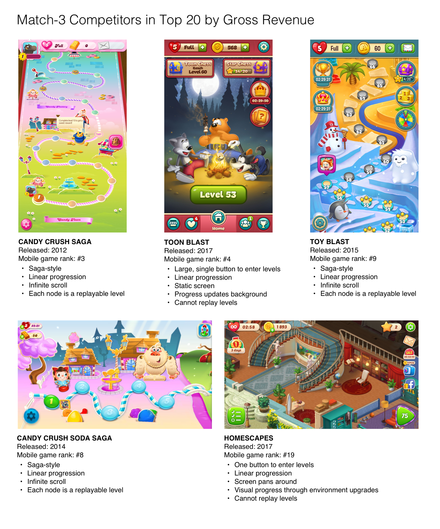
The game’s map was saga-style with nodes lined along a road. It’s a familiar paradigm to our audience effective at conveying one's progress.
But, this once industry standard had given way. The last time a top match-3 game released with a saga map was with Peak Games’ 2015 release of Toy Blast.
Because of this, a design edict came from our directors: whatever the new design, it could not be a saga map.
(Note: As of this writing, King’s late 2018 release of Candy Crush Friends maintains its saga map. The refreshing 3D twist suggests there *might* be life left in an old design pattern.)
Stakeholder Interviews & Constraints

The original map design
Eric and I spoke with analytics, engineering, product management, and game design. They revealed problems caused by the current design beyond not being on-trend:
Map nodes are buckets for levels, not an individual level itself. There is a major information architecture difference between Let’s Dish and other match-3 games. Restaurant nodes on the map were actually containers for levels, not levels themselves. The new map design needed to better convey the depth behind the node.
A line of nodes implies linear progression. 60% of players stayed in one restaurant until the next restaurant unlocked. Game design wanted players to travel between many restaurants during a session. They believed this behavior would lead to more strategic play, better engagement, and longer retention.
The static screen looked scrollable. The map’s vertical road disappeared off the top of the screen. This gave the impression of endless scrolling. Yet, engineering revealed endless scrolling was not viable due to game performance issues.
It doesn’t scale for more content. Because the screen is both static and has a vertical road, the design didn’t accommodate future restaurants. The map needed to allow for both unique one-off restaurants (like events) and for the world to grow.
It had been difficult to get team alignment. The team had iterated on the map design several times over the previous year. Getting consensus remained elusive.
Player Profile

The let’s Dish player profile (in lieu of a persona)
I also wanted to dig into what we knew about our game’s players. I talked with the user research and consumer insights teams to compile our user data into what I called the player profile.
Key user insights:
Our players self-reported multi-tasking (watching TV, commuting, waiting) while gaming.
When at a loss for what to do/where to go next, they become unmotivated.
They reported always wanting options for things to do in the game or else would quit/uninstall.
This told me:
Have a clear call-to-action to ensure recovery from distractions or uncertainty
Make sure players understand their progress
Hint at future content to drive player motivation
Requirements Sign-off
We curated the requirements from our research and conversations. This gave each discipline visibility and ownership in our process.
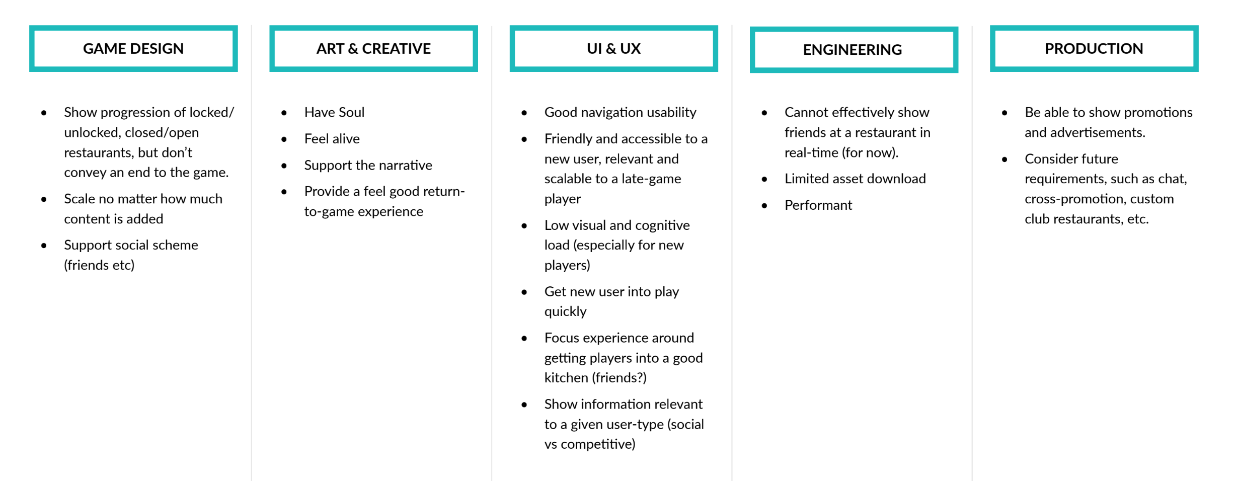
Of all these problems, altering match-3 players’ mental model to fit non-linear progression seemed the most difficult of all. We summed up the challenge:
"How might we redesign the map so the game’s non-linear progression is both clear and intuitive?"
Ideation
I felt a design thinking workshop would help break the designers out of their year-long rut. I petitioned Eric and our creative director to let me organize a fun, yet structured approach to brainstorming. I hoped to clarify feature priorities and explore new avenues not before considered.

Diverge: Worst ideas exercise

Converge: 2x2 matrix
During divergence, we managed 25+ unique map ideas. They ranged from food falling from the sky to more complex story-driven ideas like a catering schedule.
Narrowing with a 2x2 matrix helped us focus on the greatest priorities. The design needed to be easy to understand for new players, but engaging for older players. To that end, it also had to be very scalable for any new content or features. By the end of the session, we narrowed down to our top concepts for us to further explore.

I sketched the ideas and sought wider feedback from the team and our directors. This revealed some strong and often competing opinions of what a successful design would look like. After some minor changes, we turned to wireframing.
Prototype & Test

We took a hypothesis-driven approach to concept validation. We created low-fidelity wireframes from our sketches. Time-to-task and task success then determined the usability of these designs. (We used Optimal Workshop’s Chalkmark Test for those wondering. It’s lovely.)

Animal Crossing: Pocket camp

Yelp
We found that none of the designs outperformed the rest. We suggested cutting the worst performing hypothesis. This opened up the possibility of a new idea: a mini-map that took notes from Nintendo’s Animal Crossing: Pocket Camp and from Yelp.
We again diverged with our stakeholders, creating another two concepts for a total of five hypotheses. Our product manager suggested testing the usability of these ideas again at a higher-fidelity to reduce risk.
Making a Decision
Impression testing indicated a tie. The list UI hypothesis (H1) and the mini-map with animation window (H4) were the most usable concepts.

We needed to ensure our stakeholders bought into and agreed upon a final concept. Eric and I facilitated a decision matrix with the team after presenting our findings. We began with reviewing the problems and priorities. These then served as the decision framework for the matrix.
The team agreed that without a sense of place, players might not feel an emotional connection to the game. This eliminated the list UI as an option.
Answering the brief
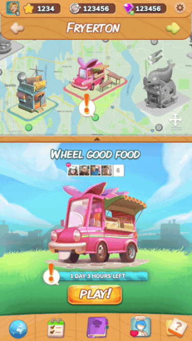
A prototype of the mini-map with animation window
The mini-map with an animation window achieved the following:
Greater scalability. The number of map nodes increased, and the ability to add paging meant the potential to add new towns.
Reduced feel of linear progress. The new design creates a focus on navigation instead of progression. Restaurants are no longer connected by a road or trail, and tapping a restaurant icon triggers the animation window to show more detail.
Clearer game progression. We recommended any progress on the map relate to each restaurant’s menu completion rather than progress to the next restaurant. This would lead to a better understanding of the game's ultimate goal: complete all the menus.
Clear, single CTA. A strong call-to-action button allows greater usability and faster recovery during multi-screen moments.
Refining the Design
With such a big paradigm shift, Eric and I wanted to continue reducing risk as much as possible. To do this, we looped through the UX process again.
We learned from HCI literature how to reduce usability issues with mobile maps. Nielsen Norman Group's research showed that most users mistake the capabilities of mini-maps. Users will try to pinch, drag, or tap a map if it seems to expand beyond the edge of the screen. Also, most mobile maps don't follow touch-target guidelines. They create too-small targets placed too close together.
With this in mind, we created another set of high-fidelity mockups. This allowed us to conduct impression testing under the guidance of the user research team. We determined:
the best mini-map placement (top or bottom)
the best CTA placement
the optimal map icon density & spacing
the optimal map icon size

Map prototype
Hand-Off & Implementation

In our hand-off conversations, it became clear we needed to scale down the design to an MVP feature set. There was no time for adding menu progression functionality to the map. Other features also backlogged included: friend metadata, event flags, and paging.
We had one last meeting to deliver final redlines and the design spec. From there, we acted as point of contact for artists and developers, answering questions as they arose.
What I learned...
Preserve the magic, but mitigate the risk.
There is a bit of luck and magic that goes into creating a successful mobile game. It needs to have the right amount of novelty, yet should also balance familiarity. The most usable design doesn’t mean it’s the most successful, but neither does something wholly new. The balance of novelty and familiarity is key, especially when a design trend shifts like we saw in match-3 maps.
Involve others in your journey.
When I joined the team, there was still a lot of uncertainty about what UX does exactly. I saw a shift in how the team viewed our discipline as we involved them more and more in the UX process. This also taught me to inquire about other disciplines and learn their processes. UX is more than design - it's also about building relationships so we can create great things together.